[This post is part of a series on Coaching Highlights from coaching Columbia Business School students. If you don’t see a Table of Contents to the left, click here to view the series, where you’ll get more value than reading just this post.]
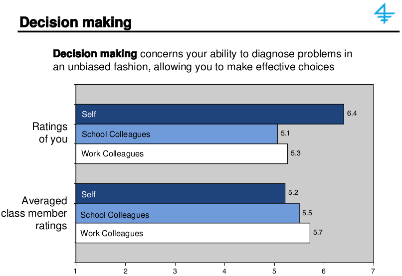
Yesterday’s post covered what for most people are the highlights of a 360-degree review — charts comparing how your leadership skills compare to others’. Those charts summarize most of the information in a 360-degree feedback report.
One should always remember they summarize. They don’t present all the information. Sometimes details tell a different story but get lost in the summary. Also, details may show how to improve better than a mere summary. Most 360-degree feedback reports include more detailed numbers. Here is a sample of more detailed numbers — the results for one specific question.
 You can probably tell these numbers combine to make one point in each of yesterday’s charts.
These numbers come from more raw data, as shown here.
 All the numbers in this table get combined into the bar chart above it. You can see there’s a lot of depth to it.
Details like these help when you decide an area you want to improve in by giving you more detail about how people viewed you. It lets you know not just how you did in problem-solving, or whatever sub-skill you’re looking for more detail on, but how specifically you’re doing.
Making sense of all these numbers makes looking at this level of detail difficult out of context. Reviewing them for a purpose makes sense, like after you decided an area to improve and have specific questions about it. Or if numbers in higher-level charts or graphs don’t make sense.
This table also shows the value of getting more people to review you so you get good statistics. When subjects have only one or two respondents, you see blanks here or large standard deviations, showing you don’t know much about that area for that person.
Tomorrow we’ll talk about qualitative feedback.
